CASE STUDY: UX & Positional Memory
Updating and modernizing the user experience of dated software without frustrating legacy users.
Challenge

Periodic updating of software is necessary to make improvements and add functionality, but we've all experienced the frustration of interfaces being re-shuffled without warning after an upgrade. The principle of positional memory – how users learn where things are located – often gets overlooked. With enough repetition, users will learn to navigate even the most poorly designed software. This becomes a challenge for designers, who want to help users by making interfaces more logical.
An open-source database company who produces a suite of popular admin tools needed to refresh their dated interfaces. The UX Director asked me to perform an assessment on their flagship product and propose an updated user experience.
There was one caveat: It was critical the updates not alienate users who depend on the software. I was reminded of the popular book "Who Moved My Cheese?" which discussed how people deal with change in work and life.
Challenge: Upgrade an aging application with an improved user experience that existing users could learn to navigate free of frustration.
Formative Research
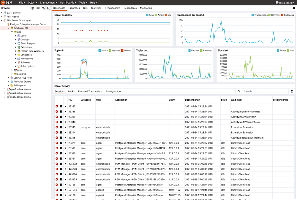
I started with competitive analysis to better understand other popular products in the space. I then spoke with users to understand their goals, pain-points and what they love about the software. I found that users liked the overall structure of the application, but an abundance of dated icons and an overly complex content directory browser made it hard to navigate the data. Additionally, some complained the light interface caused eye strain as they use it for hours at a time.
Proposed Design
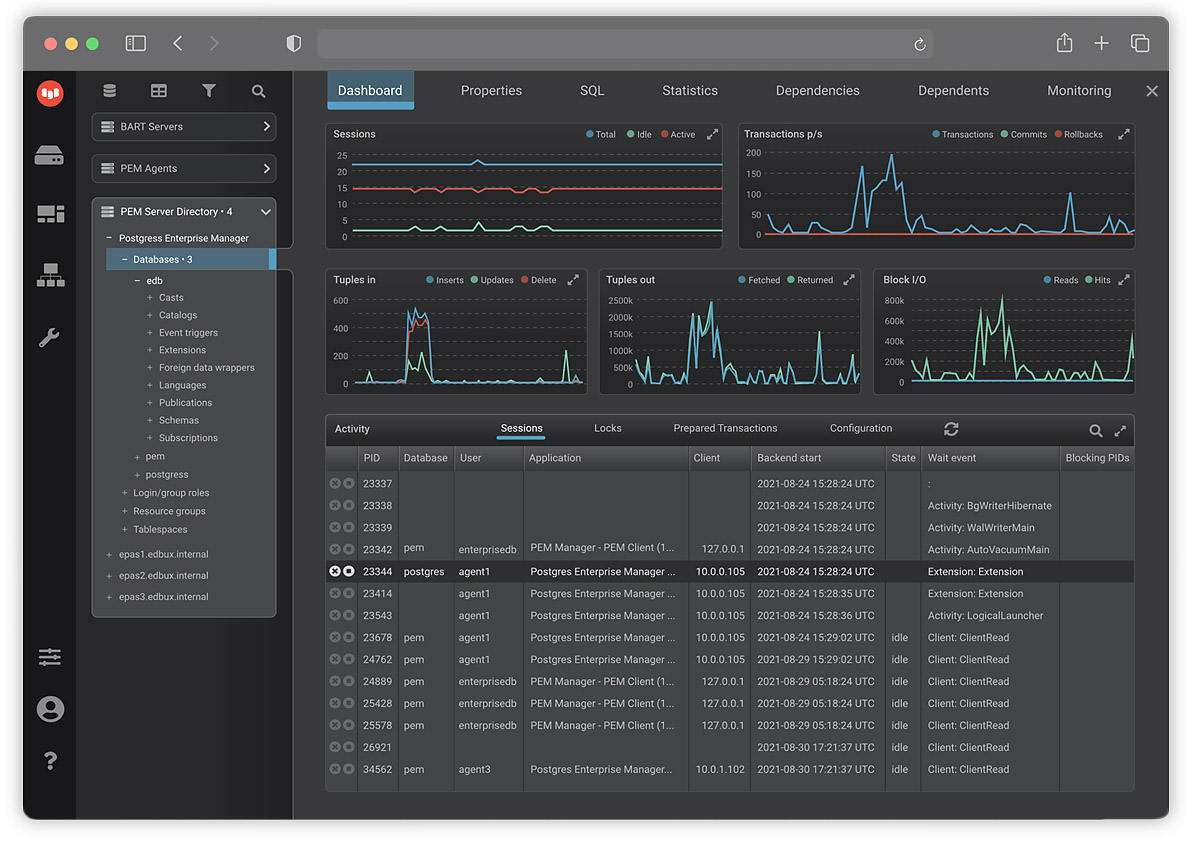
On the main dashboard page, I focused on clarifying the visual hierarchy, replacing outdated icons and reducing the visual weight of supporting elements that were distracting. I recommended a dark mode option that would reduce eye strain and emphasize the graph data. Icons were simplified and minimized. Additionally, visualizer colors were made more accessible.
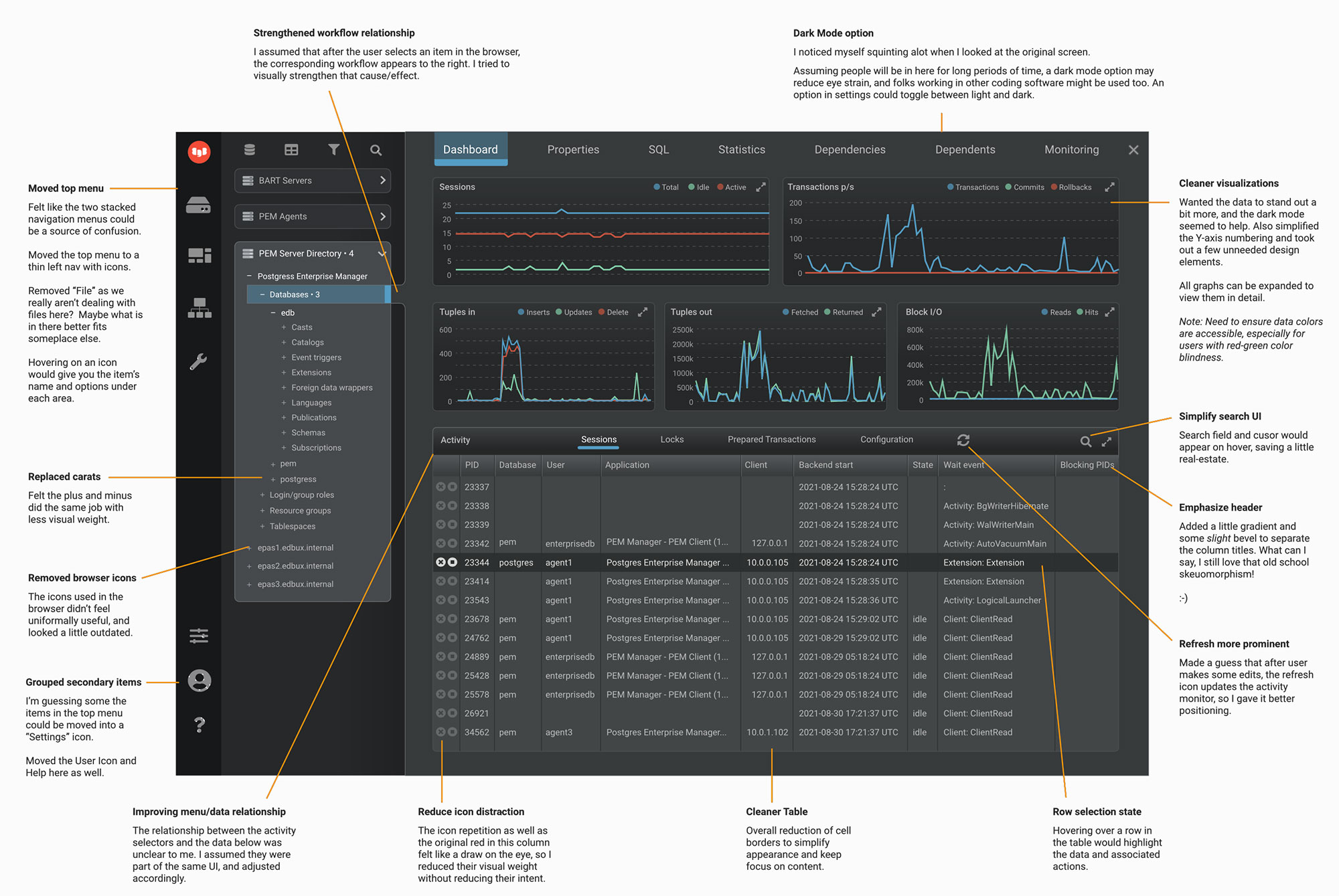
In preparation of presenting my recommendations to leadership, I annotated the new design to communicate the reasoning and benefits of the new design.
Results
Follow-up user testing found that 85% of existing users preferred the new design, as did 95% of potential new users. Ease of use, the dark mode option and legibility were the major reasons cited. Additional adjustments were made based on user feedback.