CASE STUDY: Making Earthquakes Accessible
Large corporations rely on maps that define disaster-prone regions to assess risk to their properties, but color-blind users found them difficult to read. Research and old-school color theory led me to a solution.
Challenge

To ensure corporations purchase the right amount of natural hazard insurance, my company creates maps that define where natural disasters like earthquakes are likely to strike. Each map is overlaid with bands of color called "zones" which define the probability that a disaster would strike within a given period. The company is well known for producing these maps.
When the maps were upgraded to a higher level of detail, I was asked to join the team to create new zone colors. During a meeting with the project manager, he told me that although he worked on the maps for over a decade, he couldn't actually read them because he was color-blind. He said he learned to "live with it" and didn't want to "make a fuss." I felt this clearly was an issue that could affect others and required attention.
Challenge: How can we make the maps more accessible for people with color-blindness without drastically changing the established color scheme?
Formative Research
I utilized several color-blindness simulators to understand how people with different types of color-blindness perceived the existing maps.
The simulators confirmed that it was difficult for users with common forms of color-blindness to differentiate zones. In the examples below, the 100 and 500-year zones appear very similar, as do the 250 and 500-year zones. This problem would become more pronounced as we increased the number of zones on the map.


Additionally, I interviewed current users and subject-matter experts, and I learned that the colors had become industry standards, and deviating too dramatically from them could cause confusion.
Design Hypothesis & Testing
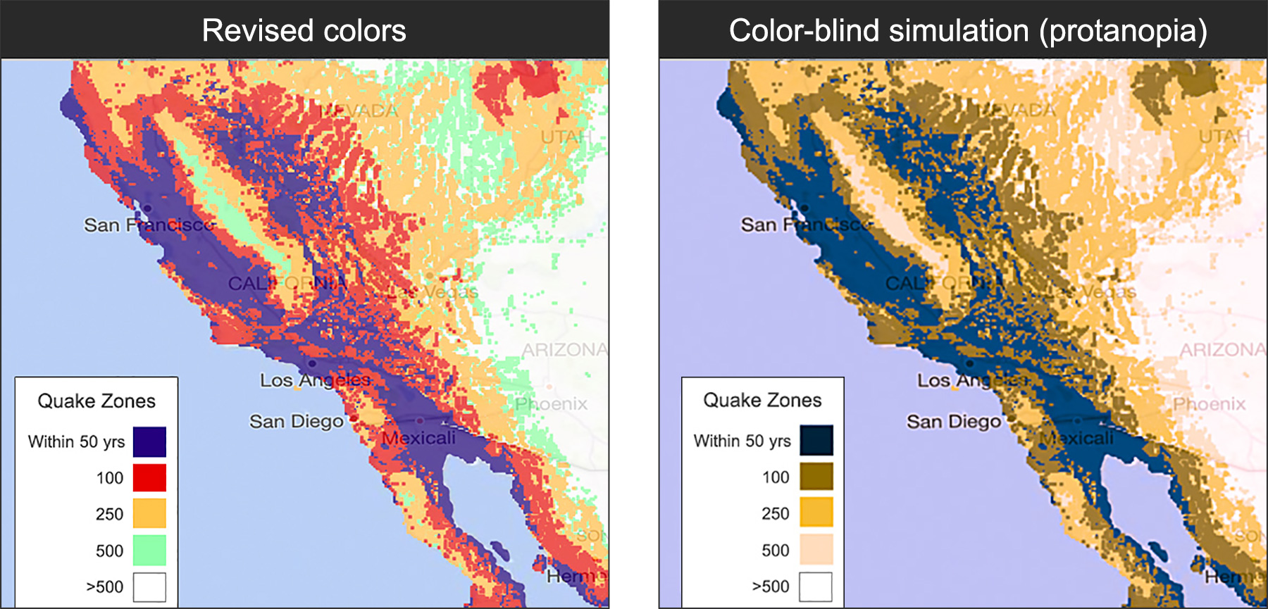
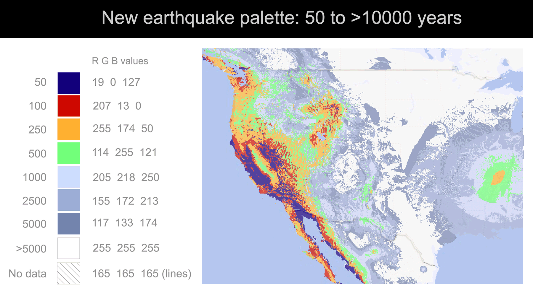
I recommended that we create a revised palette that was close enough to the original avoid confusion, while making them more accessible. To do this, I leveraged my knowledge of color theory to keep each color's hue aligned with industry standards, but subtly shift the values lighter or darker. In doing so, users with full vision could focus on the zone colors, while color-blind users could understand the zones through variations of light and dark.
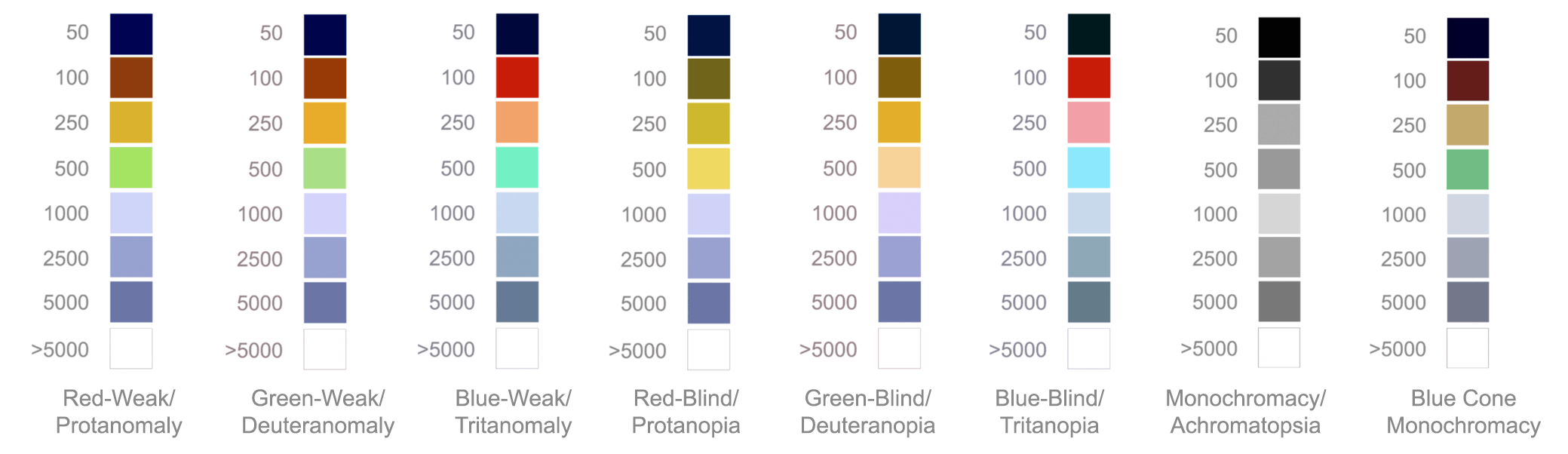
Below is a simulation of how the colors would be perceived with 8 types of color-blindness
Results
New color-blind simulations showed the revised colors performed much better. Testing with color-blind users confirmed that the revised colors improved accessibility — including for the project manager, who could finally enjoy his own maps.
The new maps were discussed in Forbes.