Selected projects
Including native mobile apps, enterprise software, web sites and interactive education
Native Mobile
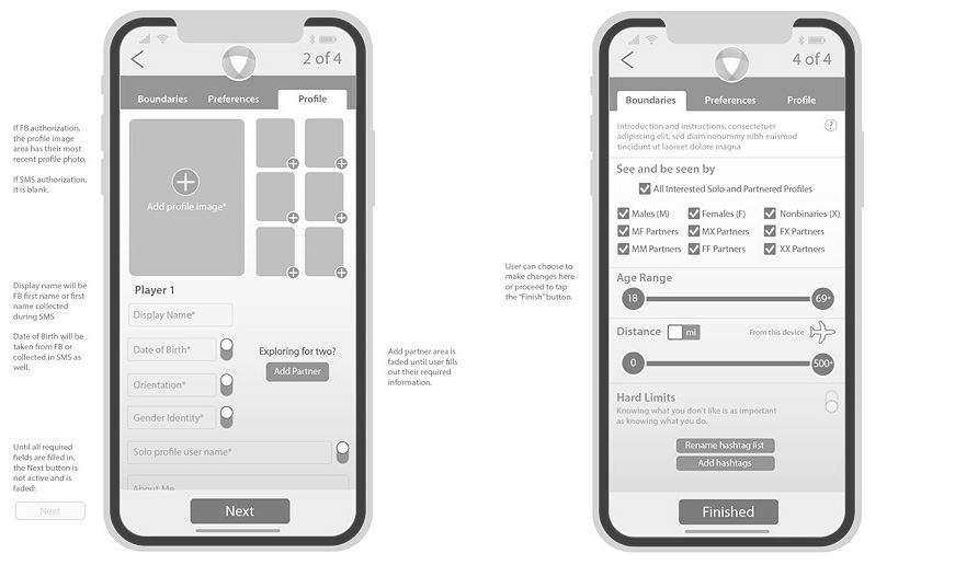
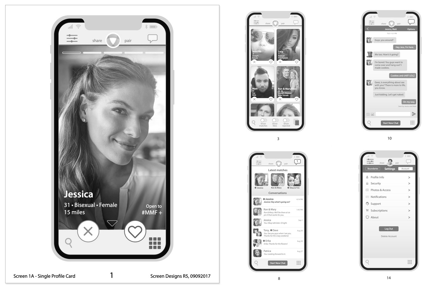
Dating app for Open
Role: Research, personas, wireframes, journey maps, design, information architecture

Read the UX story
Few dating apps focus on the needs of the LGBTQ+ community. Open wanted an experience that was more catered for these users in order to deliver higher quality matches.
Research
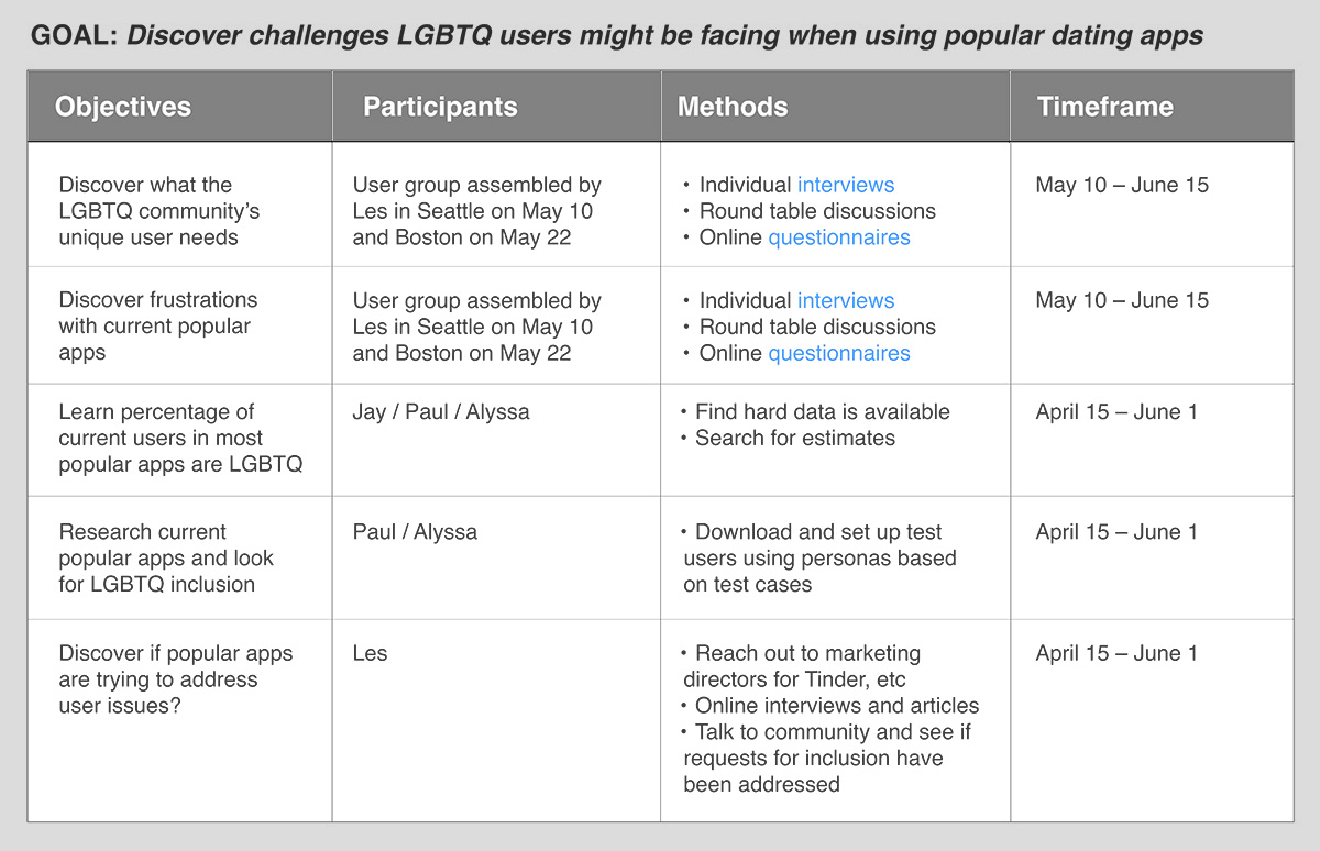
To define user goals and pain points in apps currently on the market, I created a user survey and conducted interviews. I also performed a competitive analysis of several popular dating apps.
Primary findings included the need to ensure user profiles could allow for diverse orientation and gender identity selectors – critical to producing quality matches. Online safety was also critical, as harassment is widespread in dating apps (View Case Study).
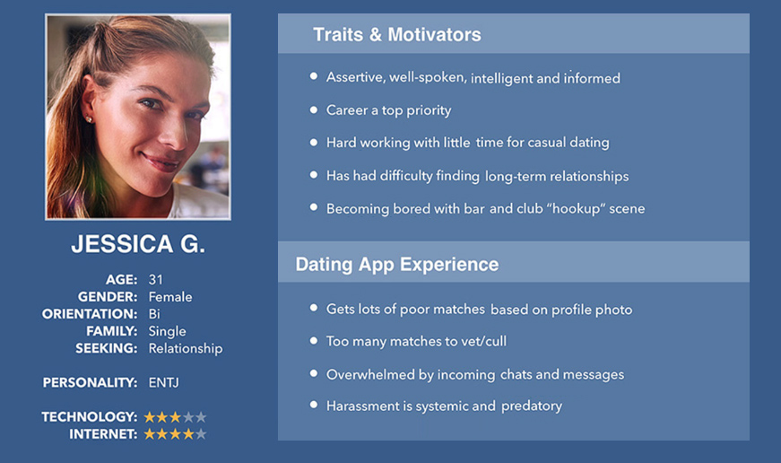
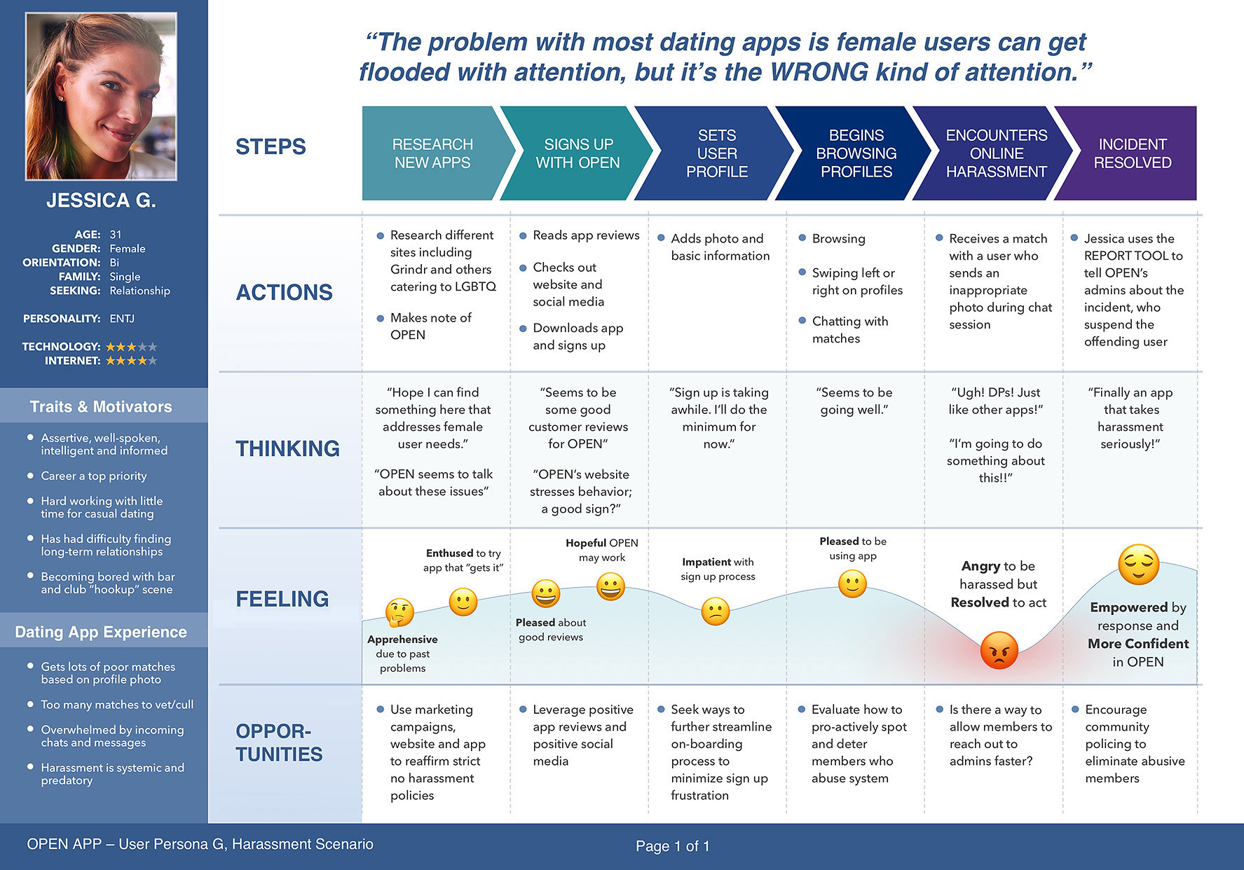
Personas & Journeys
Transforming the research findings into guiding documents came next, beginning with personas. These personas were then leveraged to build journey and empathy maps.
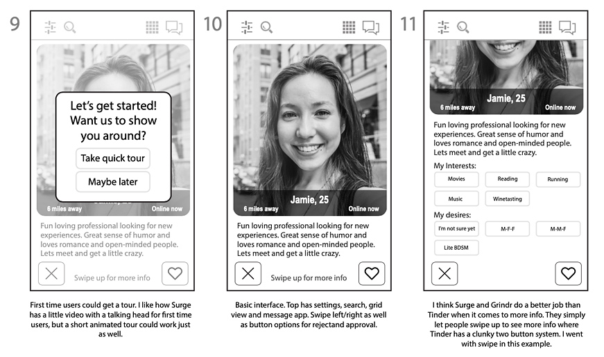
Wireframes & Flows boards
Wireframes and interaction flows were then created, followed by a simple, HTML-based clickable prototype that could allow for user testing.
High-Fidelity Designs & Development
Once feedback from testing was incorporated into the wireframes, high-fidelity designs were created and all UI elements were delivered to the development team. I partnered with the devs to guide functionality and problem solve. User testing continued throughout the process.
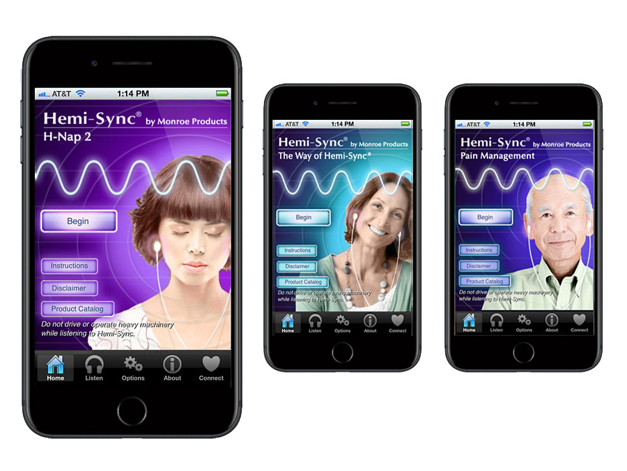
Wellness apps for Monroe Therapeutics
Role: Design, branding, information architecture, development
Enterprise software
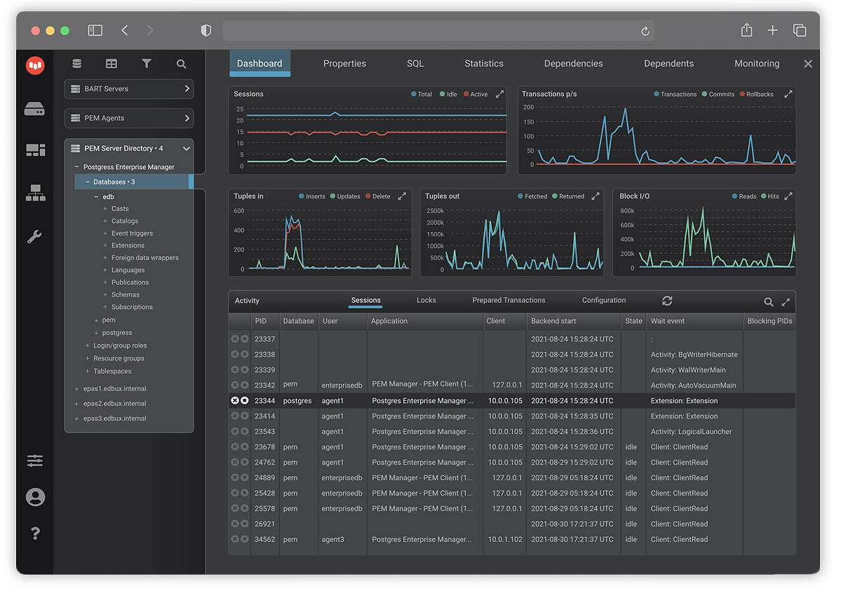
Cloud-based database management for Enterprise DB
Role: Design
Read the UX story
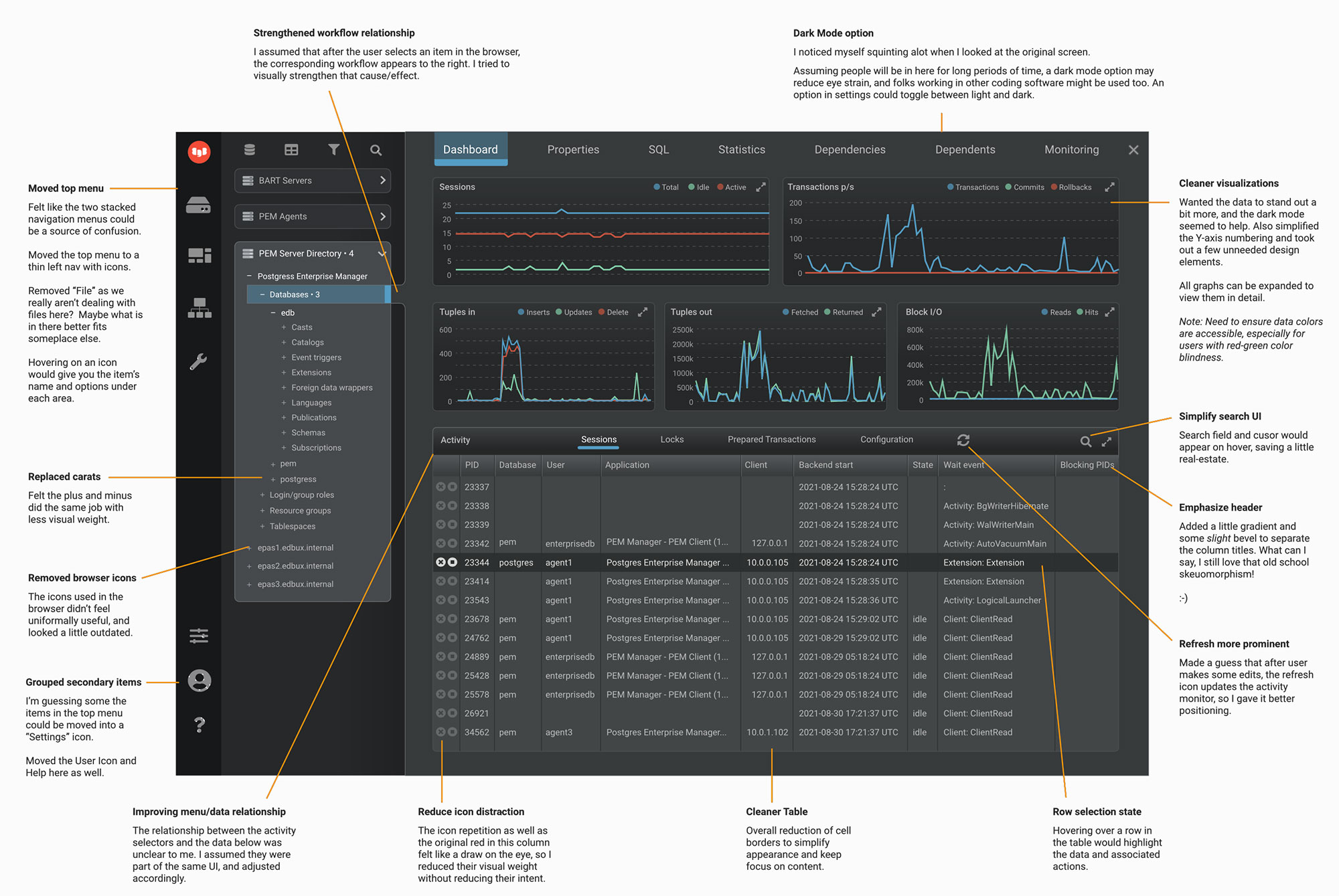
EDB's UX Director asked me to perform an assessment on their flagship software product and propose a better user experience that could guide future development.
Before
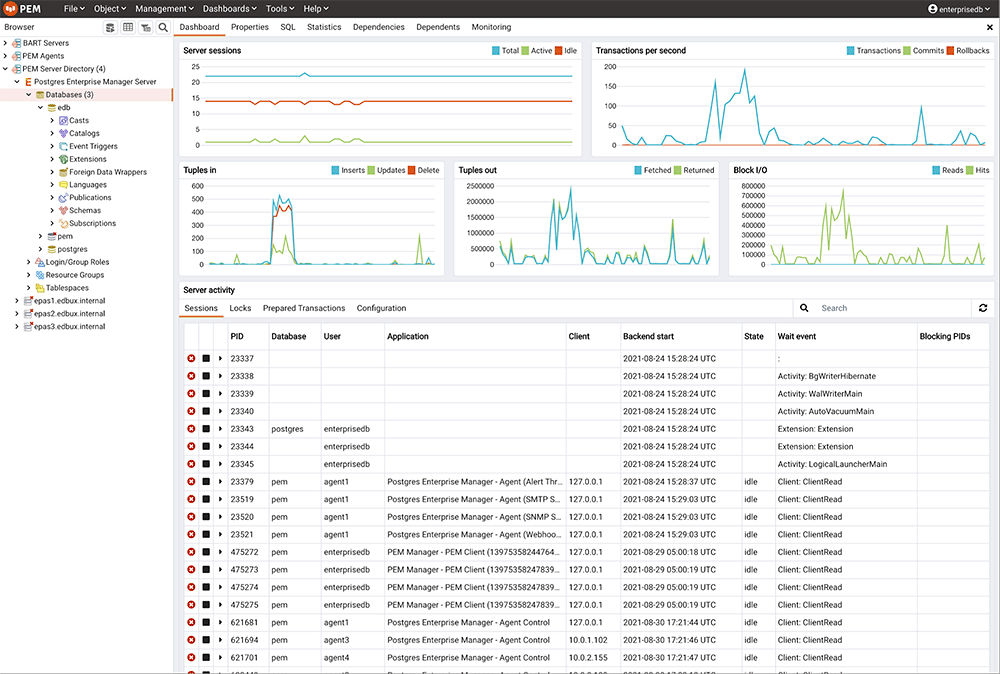
I started with competitive analysis and research into user's primary goals.
I found that the overall structure of the content was sound, but an abundance of dated icons and an unclear content hierarchy made it difficult to understand the data. Additionally, the overall bright white screen risked eye fatigue for those who used this software for hours at a time.
After
I proposed a dark mode option that would reduce eye strain and emphasize the status graphs. The visual hierarchy was more clearly defined. Icons were simplified and minimized. Additionally, visualizer colors were tweaked for the benefit of color-blind users.
In addition to presenting the evaluation to leadership and stakeholders, I annotated the new design to explain the reasoning and benefit to each edit.
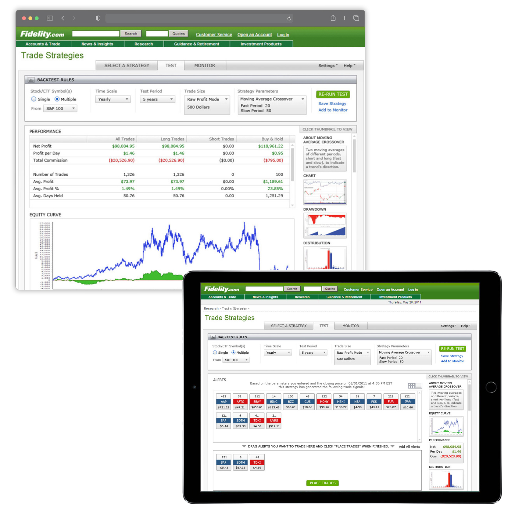
Trade strategy simulator for Fidelity Investments
Role: Design, information architecture
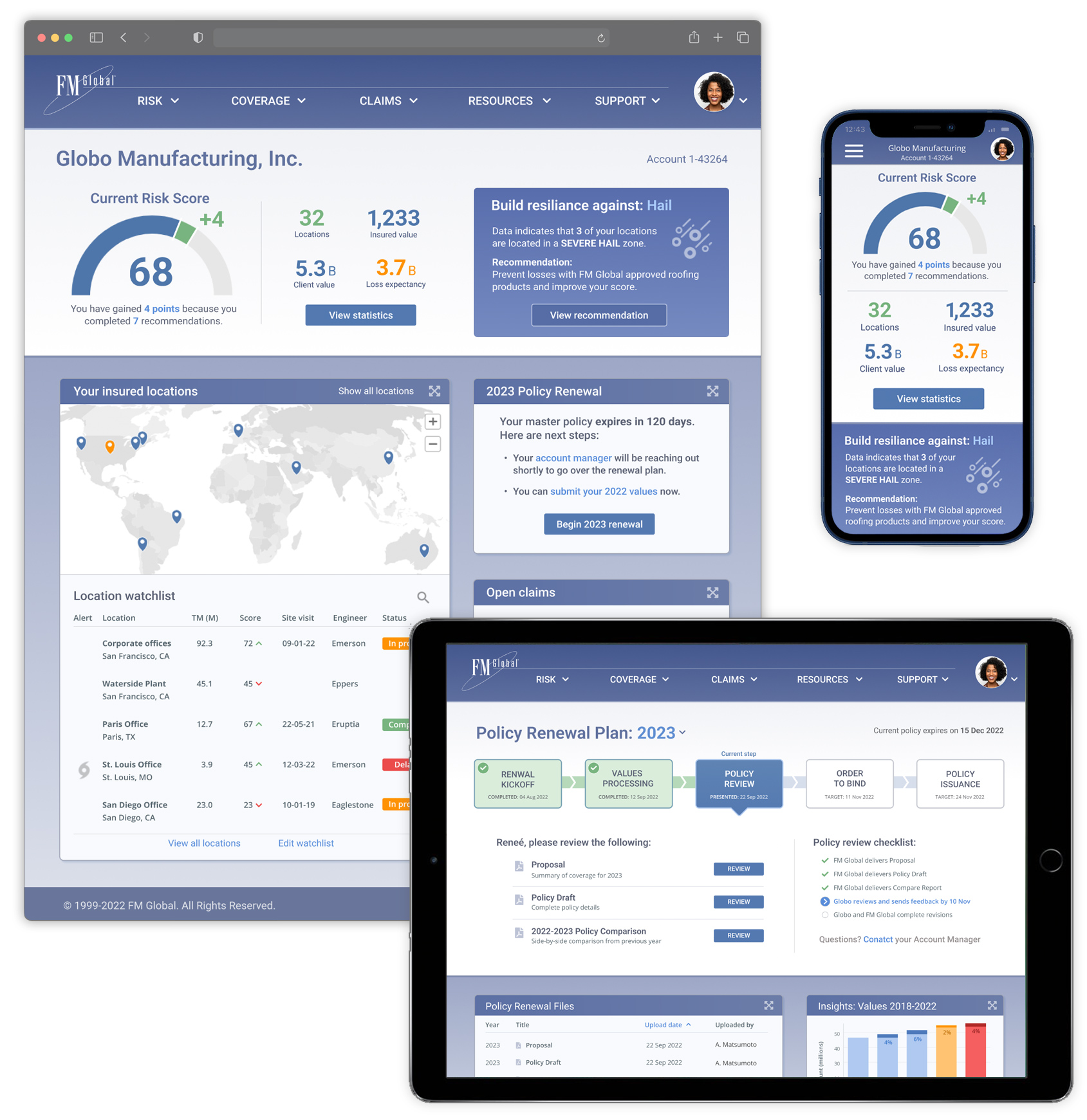
Client services portal for FMG
Role: Design, design system, information architecture, business blueprint
Web sites
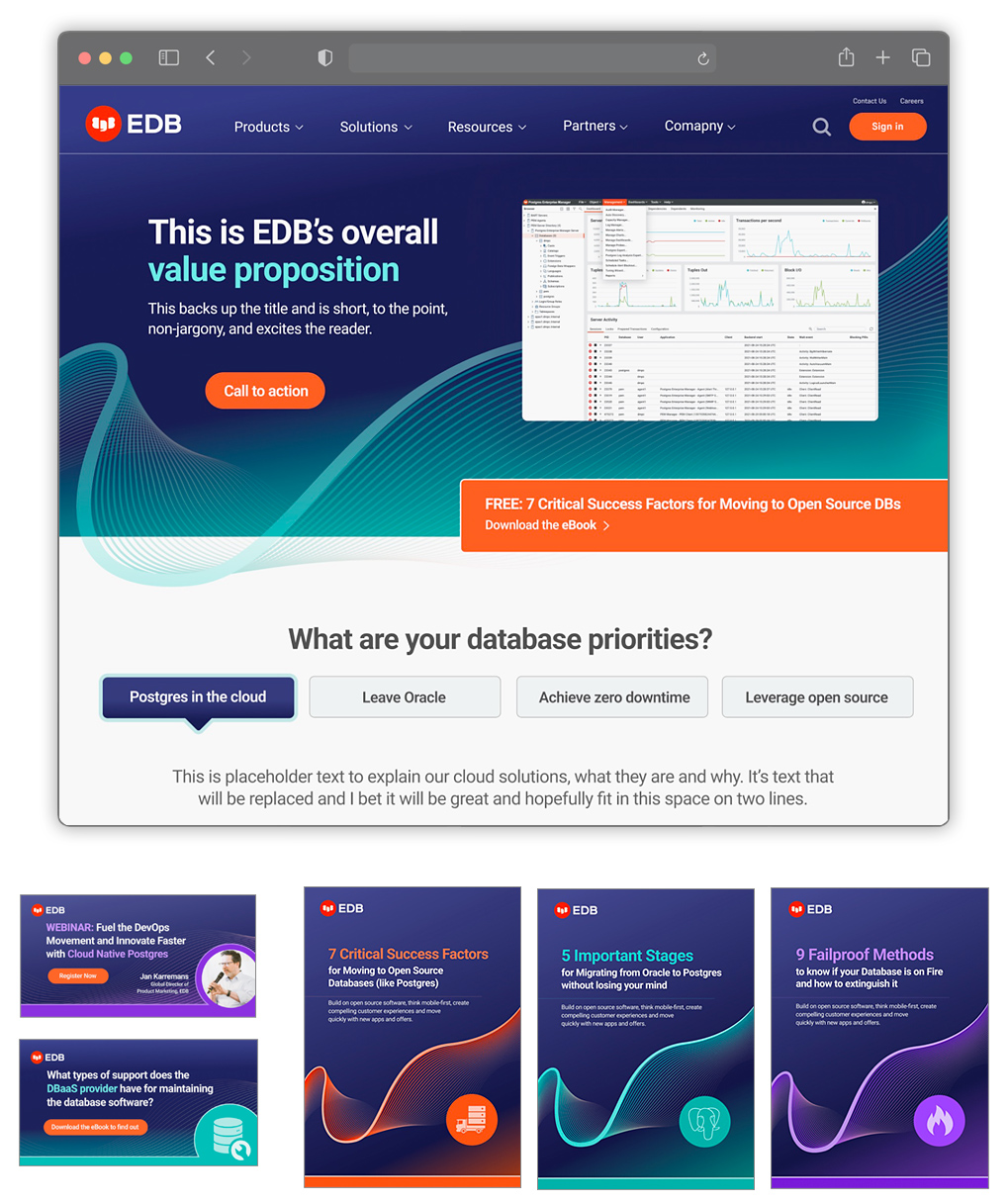
Website, brand & collateral prototypes for Enterprise DB
Role: Design
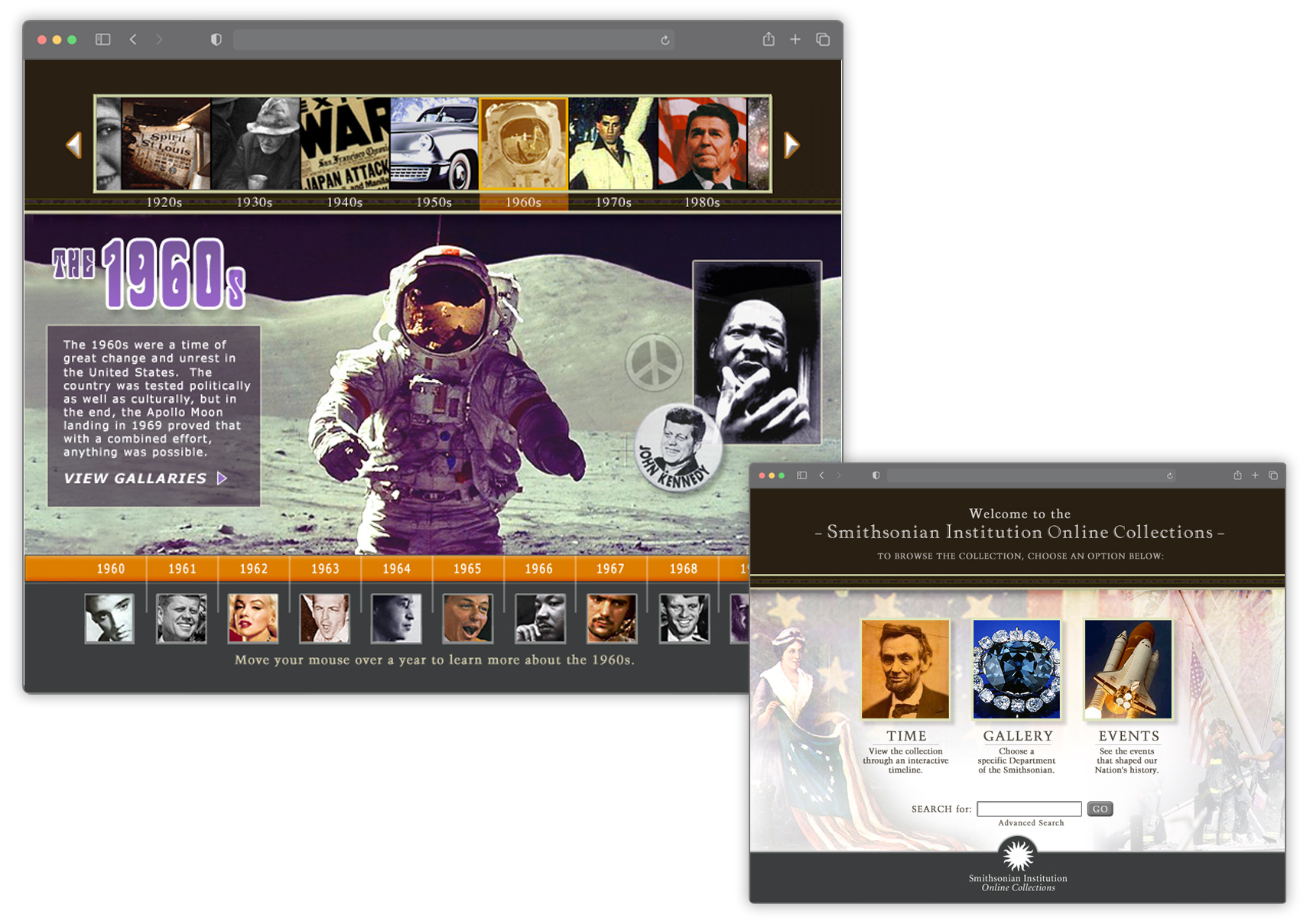
Interactive gallery prototype for Smithsonian Institution
Role: design, information architecture
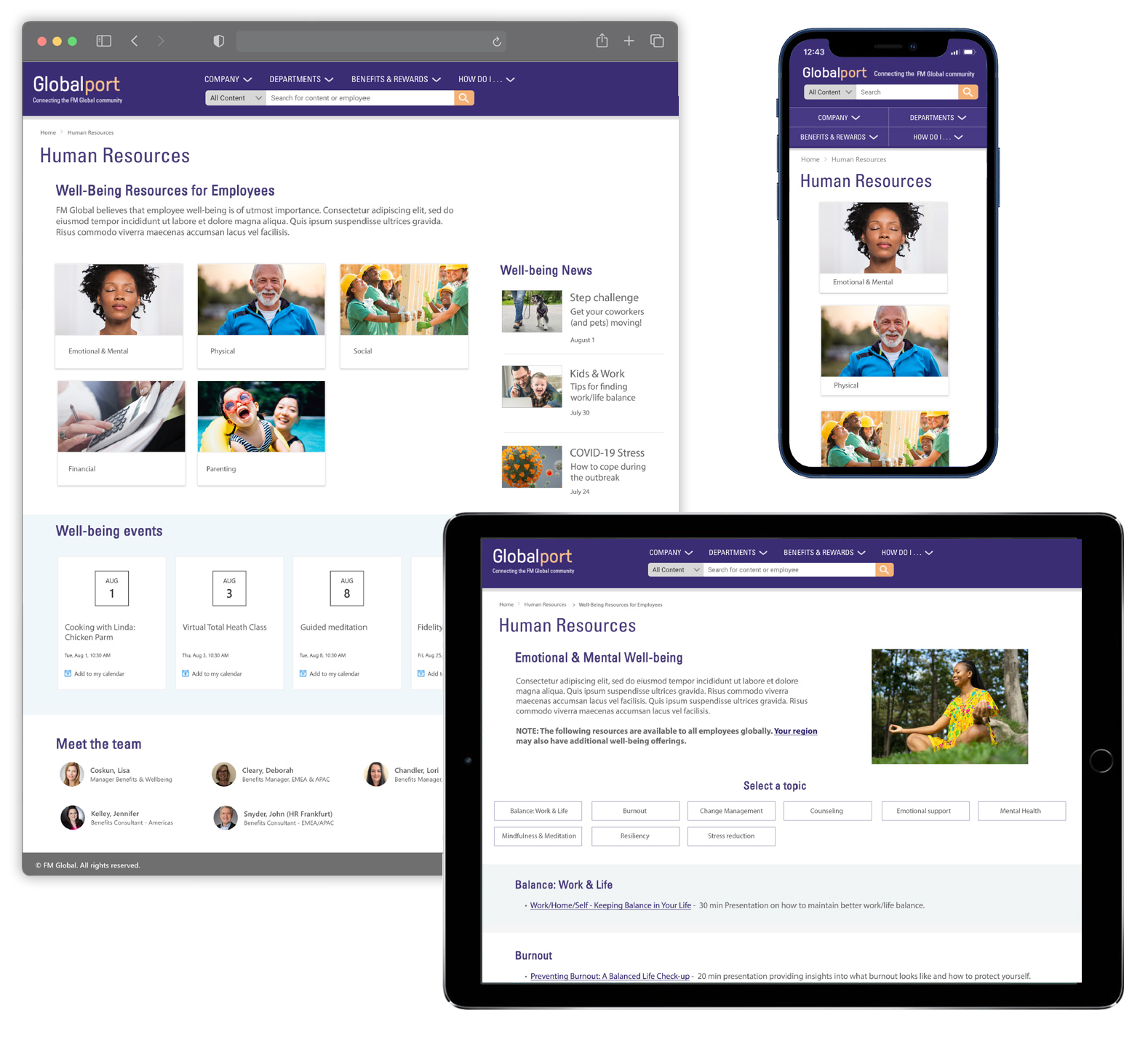
Corporate intranet for FMG
Role: Design, branding, information architecture
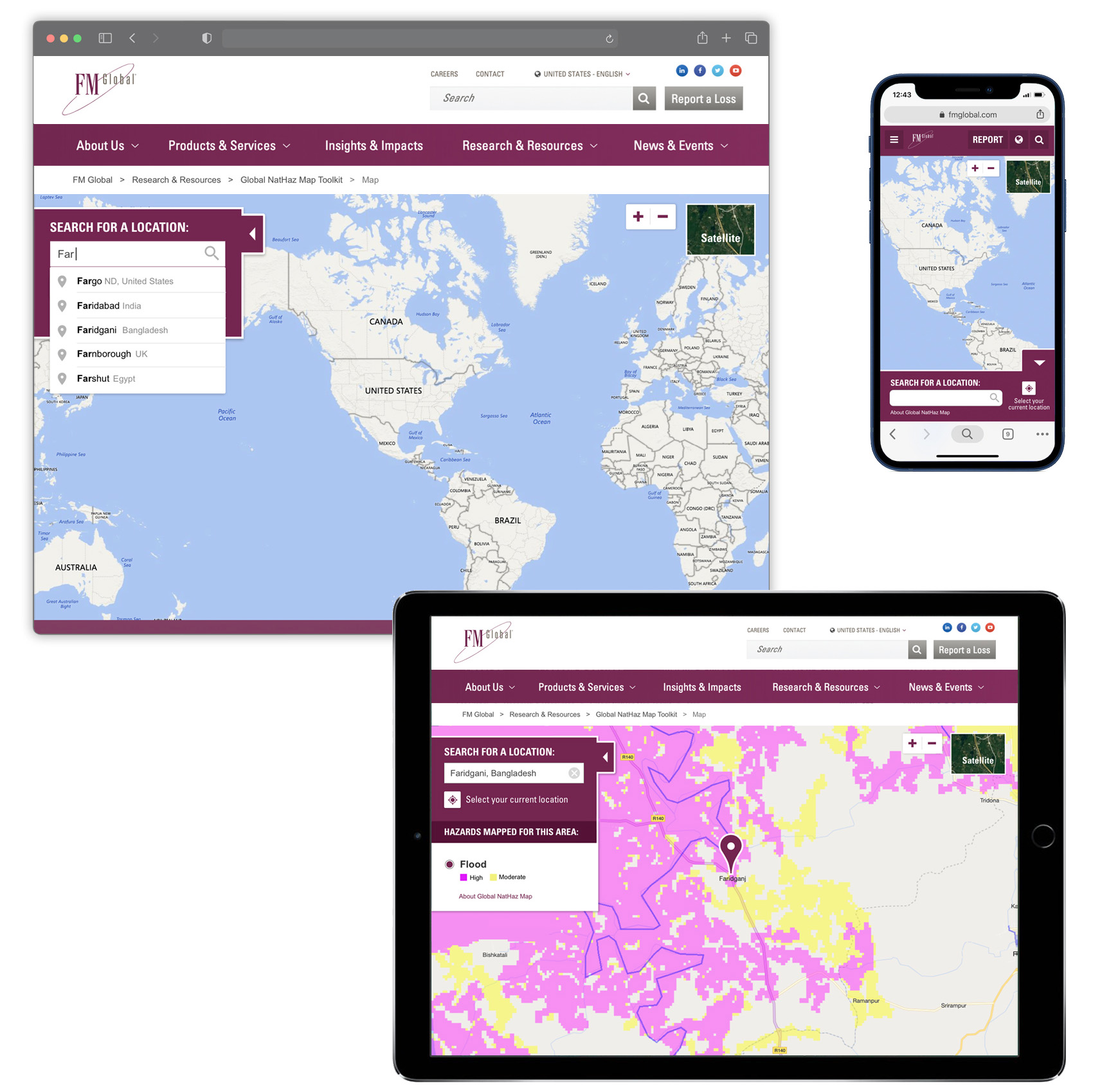
Natural hazard mapping interface for FMG
Role: Design, development
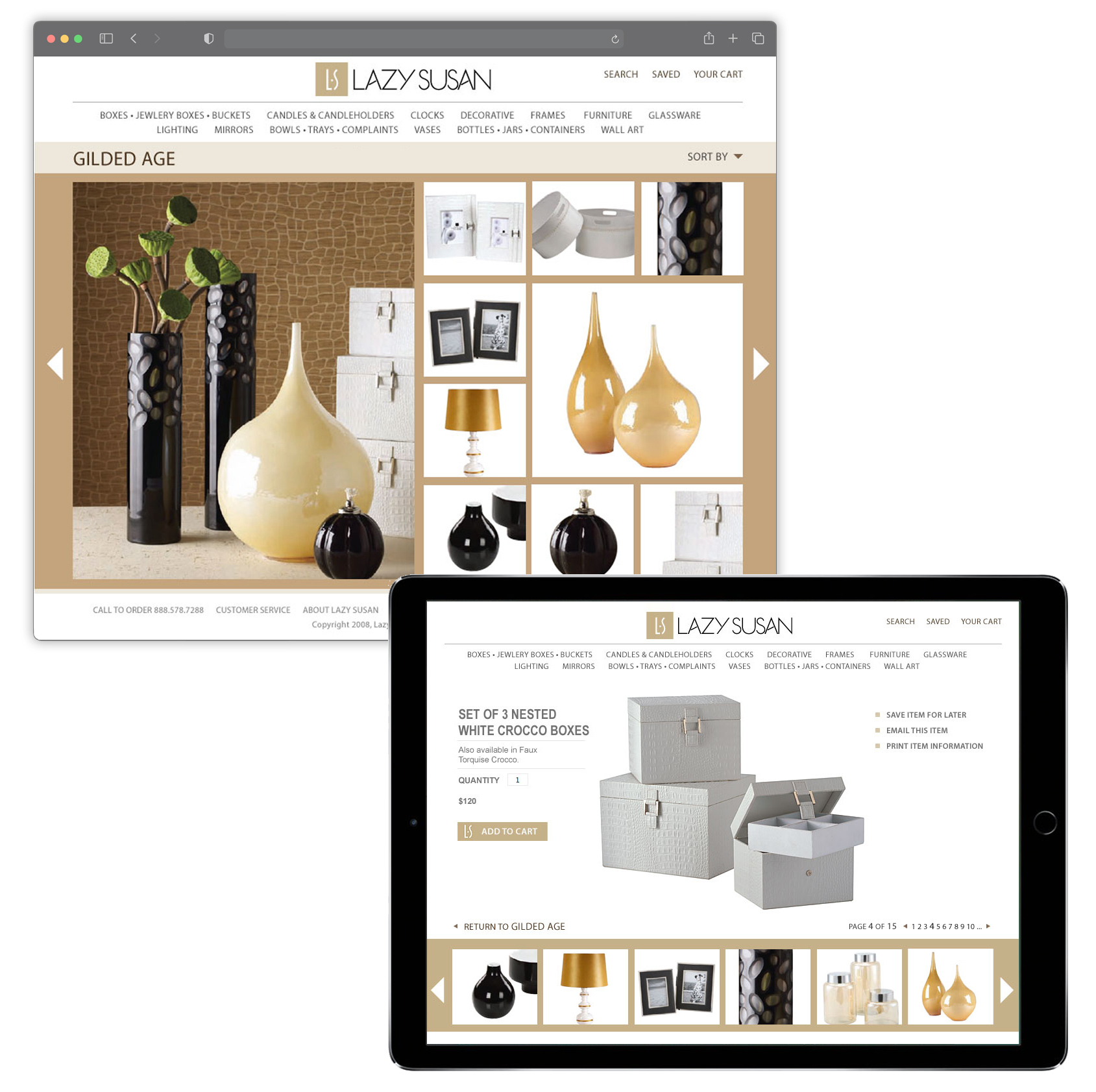
Retail eCommerce site for Lazy Susan
Role: Design, prototyping
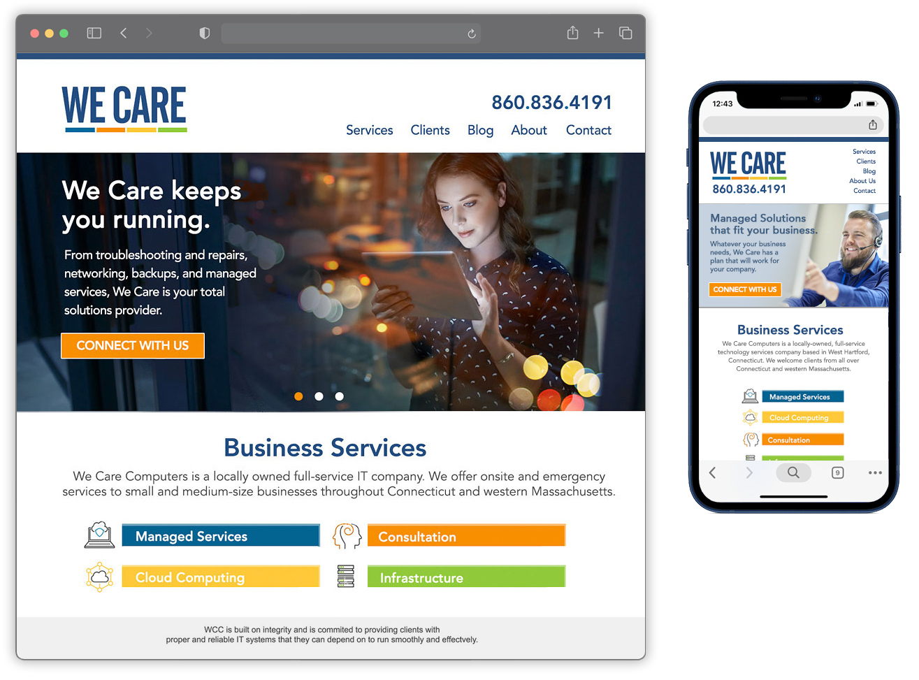
Online presence for We Care Technologies
Role: Design, development
Education
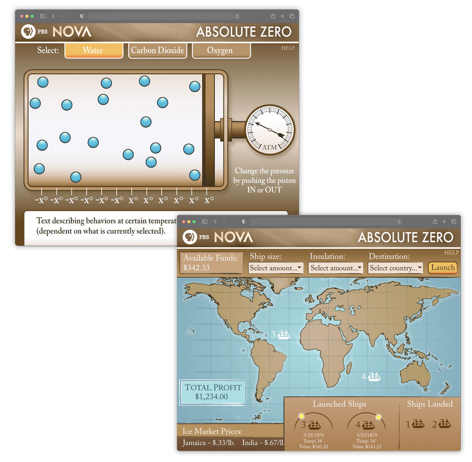
Interactive companion site to television series for NOVA & PBS
Role: Design, animation
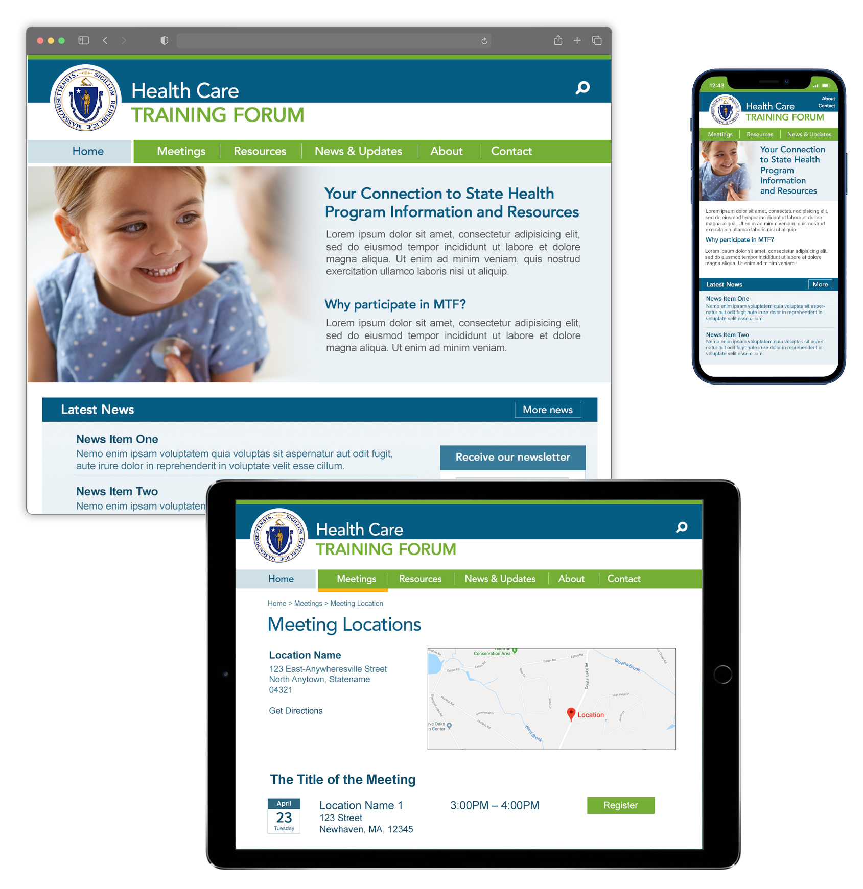
Health care portal for UMass Medical School
Role: Design, development
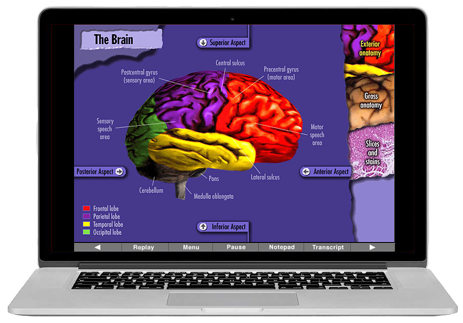
Interactive brain cancer courseware for Silverplatter Education
Role: Design, animation
Interactive Ultrasonography courseware for Silverplatter Education
Role: Design, animation
