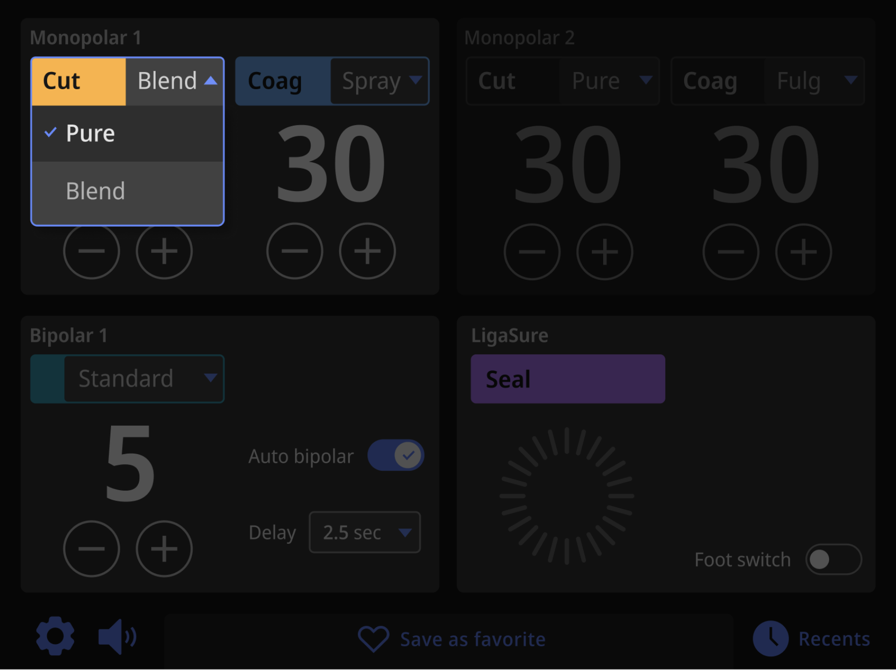
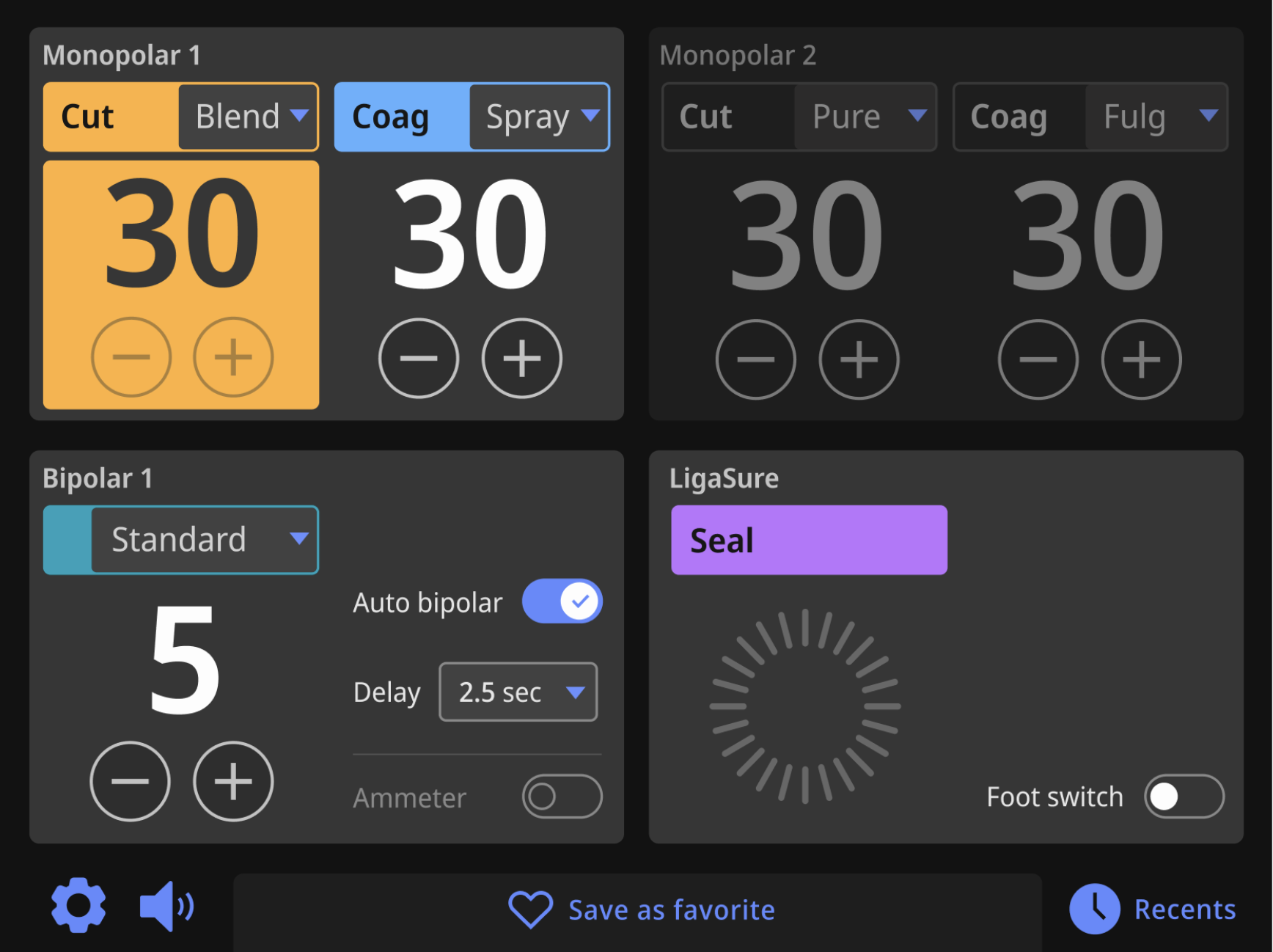
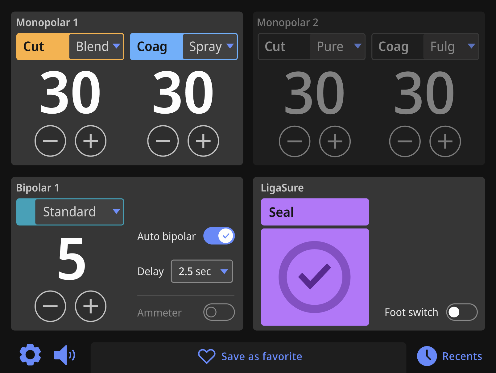
Above is the main clinical screen showing 3 of 4 quadrants active (instruments are plugged into ports 1, 3 and 4.) The Monopolar 2 quadrant shows how the quadrant should appear when inactive (no instrument is plugged in). Below, I have tried to break out the elements visually and have included the corresponding code snippets. I also indicate the CSS classes that style the element.
Code tested in Chrome, Chrome Canary (Chromium) and Safari.
Quadrants have two states depending on if an instrument is plugged into the port: Active (port with instrument plugged in) or Inactive (empty port). The HTML above shows three active quadrants and one inactive (Monopolar 2).
Adding styles to CSS class to modify states: Using the quadrant states as an example, I started with inactive as the default state, and add styles to modify the class as needed. For example, the inactive quadrant state has a class simply called "quadrant". To appear active, I added a second style to the class called "quadrant-active".
Example: <div class="quadrant quadrant-active">Active quadrant</div>
For the quadrant's title, inactive quadrants show it in a slightly darker and thinner font with the style added to the class called "quadrant-title". Active quadrants add the style "quadrant-active-title".
The buttons behave exactly as they would do the FT10.
Note: In the CSS, I have imported the plus and minus's shape data rather than refrerence an asset in the images folder. I did this so its color could be defined in CSS.
Audio: Like FT10, here is an audio file that plays when the buttons are pressed.
Here's the button used when an instrument is plugged in. Buttons turn slightly darker on press.
For Monopolar and Bipolar quadrants without an instrument plugged in, there is an inactive state. Adding "minus-inactive" to the div class and "plus-minus-icon-inactive" to the svg class will change the state. The difference is slight, but important. Also note that inactive buttons do not act like disabled buttons; they can still be pressed and effect the power number.
When energy is being applied, the power buttons are disabled, but still visible. The style called "power-button-disabled" can be added to the div class for any button. This style would also be used if when the power level is at minimum (minus disabled) or maximum (plus disabled).
Toggles on Athena are slightly larger to help users interact with them. All toggles have been wrapped in a container div. The label has its own class applied to the span called "toggle-label".
On Athena, touching the label should also affect the toggle, giving the user a larger tap zone.
To make the toggle show its disabled state, the label's class becomes "switch-disabled" and the input's span class becomes "slider-disabled". The disabled toggle's label has its own class called "toggle-label-disabled".
I figure you can restyle an existing React component to recreate these, so I focused on the styles.

The drop downs for mode settings function the same way as basic drop downs seen above, but the visual design is more complex.
Other notes:
Mode drop downs on a inactive quadrant act the same as active ones, but the selector is styled differently. I've added another style to the main div's class ("mono-2-cut-borders-inactive"), the button ("mono-2-cut-inactive") and the divs containing the modality ("modality-inactive") and mode ("mode-inactive"). The drop menu itself is the same.
Note: The blue arrow on inactive mode drops is set to a lower opacity in the CSS.
Like quadrants, the large power level number can be active or inactive. Inactive is the default.
The inactive number (example on left) is slightly darker and thinner than active (example in center). An additional style added to the class called "power-level-active" makes the number appear active.
Examples on right shows how the power appears at start-up before power has been set in both inactive and active states. Style added to class there is called "power-level-empty" (the font style for the dashes changes as well).
The power level number and the plus/minus buttons below are enclosed in a div called "power-level-wrapper". Changing the classes in this div can show energy applied states. As you can see, when energy is applied, the div and its elements change in appearance.
Animation: The change in appearance should be a fast fade transition of .2 secs.
Below are examples of how Monopolar Cut, Monopolar Coag and Bipolar look when energy is applied.
Example 1: Monopolar Cut without (left) and with (right) energy applied.
Mock up of Monopolar Cut energy being applied:

Example 2: Monopolar Coag without and with energy applied.
Example 3: Bipolar without and with energy applied.
In each example above, three styles are added to existing classes:
Energy applied on LigaSure looks a little different. There are two stages: energy cycle, and energy success. For the energy cycle stage, like on the FT10, there is an animation. When the cycle is completed, we will see the energy success stage: a solid circle and checkmark.
Animation: The cycling animation is a svg file which rotates in a manner defined in CSS.
Audio: Like the FT10, there are two audio files that correspond to the cycling and success stages.
Example 4: LigaSure without energy applied, the energy cycle stage, and the energy success stage.
Mock up of LigaSure energy being applied:

Mock up of LigaSure energy success:

Shared Coag is a special function selected through the Monopolar 1 or 2 dropdown menu. It has a similar appearance to the FT10 and works the same way.
The example below shows the shared coag without energy being applied. Note that the toggle in the coag drop menu is set to ON.
The example below shows the shared coag with energy being applied.
Note the dark gray arrow pointing to the left and right. This indicates that the instruments plugged into port 1 and 2 are both applying coag energy. Like the FT10, if a side is not applying energy, the arrow would not be visible.
Bipolar resection is just a simplified version of the Monopolar quadrants. No dropdowns are available. Bipolar resection is only available in the lower-right quadrant.
Note: The only instance that you would see a "inactive" version of this instrument's quadrant would be if you loaded a previously saved favorite that had the bipolar resection included. I think we need to decide as a group if this will be possible. Regardless, I added the inactive styles in the css in case we need them, but they are the same colors as monopolar CUT and COAG.
Quadrant-specific alarms requires adding some new HTML in each quadrant directly after the initial DIV:

The alarm priority is set but adding a compound class after "alarm". The three options for priority are "alarm-high", "alarm-medium-low" and "alarm-info". They will work in any quadrant regardless of the quadrant being active or not.
The warning icon is defined in the CSS, so no image needs to be loaded. It can be hidden by apply the style "icon-warning-hide" (but you may have a better way to do this!).
The alarm title and content are then added to their appropriate DIVs. In the Monopolar 1 example, I have added HTML styled bullets to the content to show it is possible, but I'm not clear how alarm content is currently formatted.
In the Bipolar quadrant, there is an example of an extra symbol. The position and the size of the icon is automatically controlled by the CSS. In the LigaSure quadrant, there is an example for an optional dismiss button.
NEW CODE/STYLES/IMAGES ADDED: In the CSS, the alarm styles start around line 1122, and you'll also need the color variables for ALARMS and MODALS starting around line 126. There are also two new files added to the images folder: "symbol-rem-pad.svg" and "symbol-reuse.svg".
Centrally located alarms are for system-wide issues. The example below shows the darkened screen for a central error with a slightly smaller box positioned in the center of the 4 quadrants.
This alarm works with all the same styles and HTML as the quadrant-specific alarms, including using images or buttons if necessary!
The only system-wide alert that is not centrally located is the REM pad. It is centered between the two Monopolar quadrants.
After 10 seconds, the alert will be minimized to a icon centered between the two Monopolar quadrants.
Centrally located alarms are for system-wide issues. The example below shows the darkened screen for a central error with a slightly smaller box positioned in the center of the 4 quadrants.
This alarm works with all the same styles and HTML as the quadrant-specific alarms, including using images or buttons if necessary!